
How a sublimated jersey is actually built
A jersey is the most demanding garment in teamwear, because nothing hides. Every seam is on show, the number is read from thirty metres away, and the same design has to work on a youth small and an adult XXL. These are the production decisions that separate a kit that looks bought from one that looks made.
Why jerseys are the natural home of full sublimation
Teamwear is the one garment category where the print is expected to cover the whole surface, and jerseys are the extreme case. Contrasting side panels, a gradient across the chest, a club crest, a sponsor mark, the player's name and a two-digit number — a traditional surface print would need a separate screen and a separate registration pass for every one of those elements.
Sublimation removes all of that. The artwork is printed onto fabric while it is still flat, the panels are cut to the pattern afterwards, and the whole composition — crest, sponsor, number, name, panels — is printed in a single continuous pass. There is no per-colour setup, so a jersey with eleven colours costs the same to print as one with two.
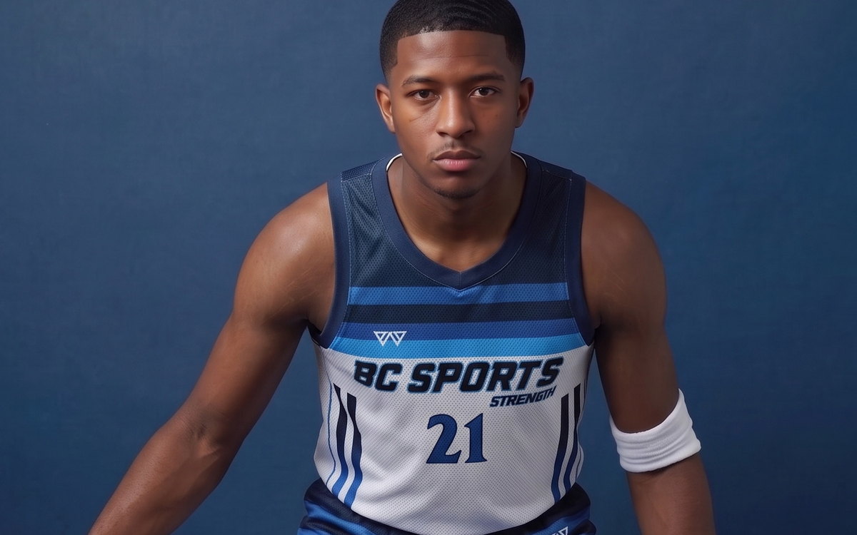
The consequence worth internalising: everything you can see on a sublimated jersey was decided in a file, not on a press. Which is good news for a design change and unforgiving of a weak file.
Numbers: size, placement and the rules that govern them
Numbers are the most common source of a returned jersey, and almost always because the size was chosen for appearance rather than for the rulebook. League and competition regulations differ, so the reliable approach is to ask your league for its written specification and pass it to us — but the typical bands give you a starting point:
| Element | Typical requirement | What goes wrong |
|---|---|---|
| Back number height | Around 20 cm on senior kits, smaller on youth | Printed to look balanced in the mock-up, then rejected at registration for being under the minimum. |
| Front number height | Around 10 cm, often optional in amateur play | Omitted at design stage because the league never asked — then required at finals. |
| Digit stroke width | Heavy enough to be legible at distance; thin digits read as decoration | An elegant thin display font that disappears at thirty metres. |
| Placement on the back | Centred between the shoulder seams and the waist, clear of the sponsor | Collides with a back sponsor that was placed first. |
Two practical notes. First, design the number and the sponsor zone together — they compete for the same real estate and a late addition forces a redesign. Second, the number has to be re-scaled per size, not simply enlarged with the pattern; a number that is correct on a medium looks cramped on a 3XL if it is scaled proportionally with the block.
Reversible sets: the construction question buyers forget to ask
A reversible jersey is two garments joined into one, with a light colourway on one face and a dark on the other. It is standard in training and school programmes because one piece covers both sides of a scrimmage.
The engineering problem is show-through: printing a dark graphic on one face and a light one on the other, on a single layer, produces mud. Proper reversible construction uses two separately printed faces with an opacity barrier between them, and the seams are bound so the garment can be turned inside out without exposing a raw edge. That is a different, heavier build than a standard jersey, and it is not something that can be improvised at the sampling stage.
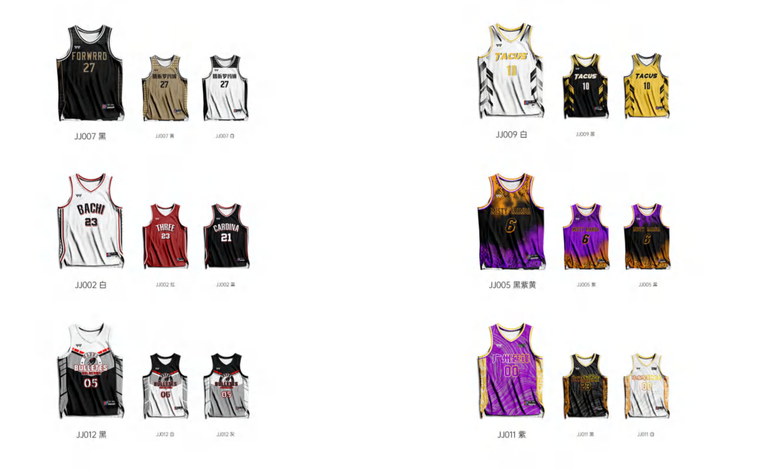
If your programme needs reversibles, specify it in the first message. It changes the pattern, the fabric choice and the sampling sequence — quoting it as an afterthought to a standard jersey produces a sample that has to be rebuilt.
Sponsors and crests: positioning is a design decision, not a layout one
Most club jersey problems trace back to a sponsor logo that was treated as a sticker. Three rules that hold up in production:
- Give every mark a defined safe area. A sponsor that runs into the side panel will be cut in half by the seam once the panel is cut to the pattern — the flat mock-up never shows this.
- Respect the reading direction of the garment, not the file. Left chest and right chest are named from the wearer's perspective in most specifications, which is the opposite of how they appear in a front-view artwork file. Confirm the convention before placement.
- Keep crest artwork vector. A club crest lifted from a website is usually a small PNG; enlarged across a jersey back it pixelates, and no amount of printing skill recovers it. If the only file the club has is low resolution, ask for the vector original or budget for a redraw.
Woven crests and embroidered badges are a different matter: they are applied after sewing, they carry their own minimum and tooling, and they cannot be sublimated. If a club insists on a raised badge, plan it as a hybrid — sublimated body plus embroidered crest — and expect the sampling to cover both.
Changing colourways between seasons
This is where digital production genuinely changes the economics for a club. Because there is no screen and no plate, a colour change is a file edit:
- Second or third kit based on the same template — same pattern, same panels, new palette.
- Home and away in one order — two colourways, one fabric run, one shipping cost.
- Mid-season accent change for a sponsor rebrand or an anniversary kit, without re-tooling cost.
- Youth and senior squads on the same design, graded differently, with no duplicated setup.
Each distinct design or colourway is quoted as its own programme, so the colour count inside a single design is free while a second design is a second minimum. That distinction catches people out: eleven colours in one jersey is no problem at all; a red home and a white away are two programmes, even if the artwork is otherwise identical.
The five artwork mistakes that delay a jersey order
In rough order of frequency, these are the files that come back for revision:
- Built at mock-up scale. An A4 layout stretched to a 1:1 jersey block loses all its resolution. Build at final printed size.
- RGB colour that shifts on conversion. Bright RGB greens and oranges are the worst offenders. CMYK artwork or a Pantone target avoids the surprise.
- No bleed and no seam allowance discipline. Detail placed within the seam allowance disappears into the stitch — which is fine if it was intended and a defect if it was not.
- Flattened single-layer files. A merged mock-up means we separate the panels ourselves, which adds an approval round. Layered front, back and sleeve files place far faster.
- Live text and hairline strokes. Fonts that are not outlined can substitute on another machine; strokes under roughly 0.5 pt break up in the print.
None of these are fatal. All of them cost calendar days, and they cost them at the point where a season deadline is closest.
What to send with your first enquiry
The fastest route from enquiry to a usable quotation is a single message containing:
- Sport and garment — basketball set, soccer kit, training tee, and whether shorts are included.
- Quantity and size split — even approximate. Mixed sizes in one order are fine.
- Number of distinct designs or colourways, because that is what drives the programme count.
- Artwork — a link to a Drive, WeTransfer or Dropbox folder is enough to start; vector is better than raster.
- Date you need the kit in hand, not the date you want to order.
- Any league or school requirement on number size, placement or crest.
A digital mock-up comes back with the quotation, so you are approving a picture of your own jersey rather than imagining one from a specification sheet. Physical sampling follows approval, and bulk production runs on a fixed schedule agreed before any deposit — the order process guide sets out the eight steps in order.
Send your artwork, quantity and size breakdown — a free digital mock-up comes back with the quotation.
Request a quote